Bringing Life to Learning
Keeping K-12 students engaged in sometimes dry topics can be a struggle, but guiding their focus to the elements of a lesson that you want them to focus on is critical to keeping them on track with the class.
In my time at QuantHub, designing for this audience was critical, and in that effort I introduced a few key changes to their activities.
- Clear contrasting colors guiding their eye to interactive elements, and de-contrasted treatments for less important elements
- Clear differentiations in scale between elements of importance, keeping them focused on the right content zones
- I introduced key animations on certain elements to bring some pageantry and “fun” to the experience. The gamification elements ceased to be static information readouts and became active parts of the user’s enjoyment.
It was also important to design an interface that could work within an LMS that would crush the interface as small as 768px at times, even on the user’s desktop or Chromebook.


Guardian Preparedness Check
The Guardian Browser is Meazure Learning's custom Chromium-based browser built in Electron and used for high-end test proctoring. It’s a bespoke high-security web browser built to lock down a user’s system while they’re taking an academic or professional test. The app runs a two-way video and audio stream while sharing the user's screen and up to two additional camera angles, all threaded and compressed locally.
In order to ensure this process could run smoothly, Meazure needed a new method of testing a user's hardware and connection that would be future-proofed regardless of new hardware standards.
The new product would also need to represent a substantial upgrade in fit and finish over the previous solution, incorporating new brand standards and accessibility requirements.
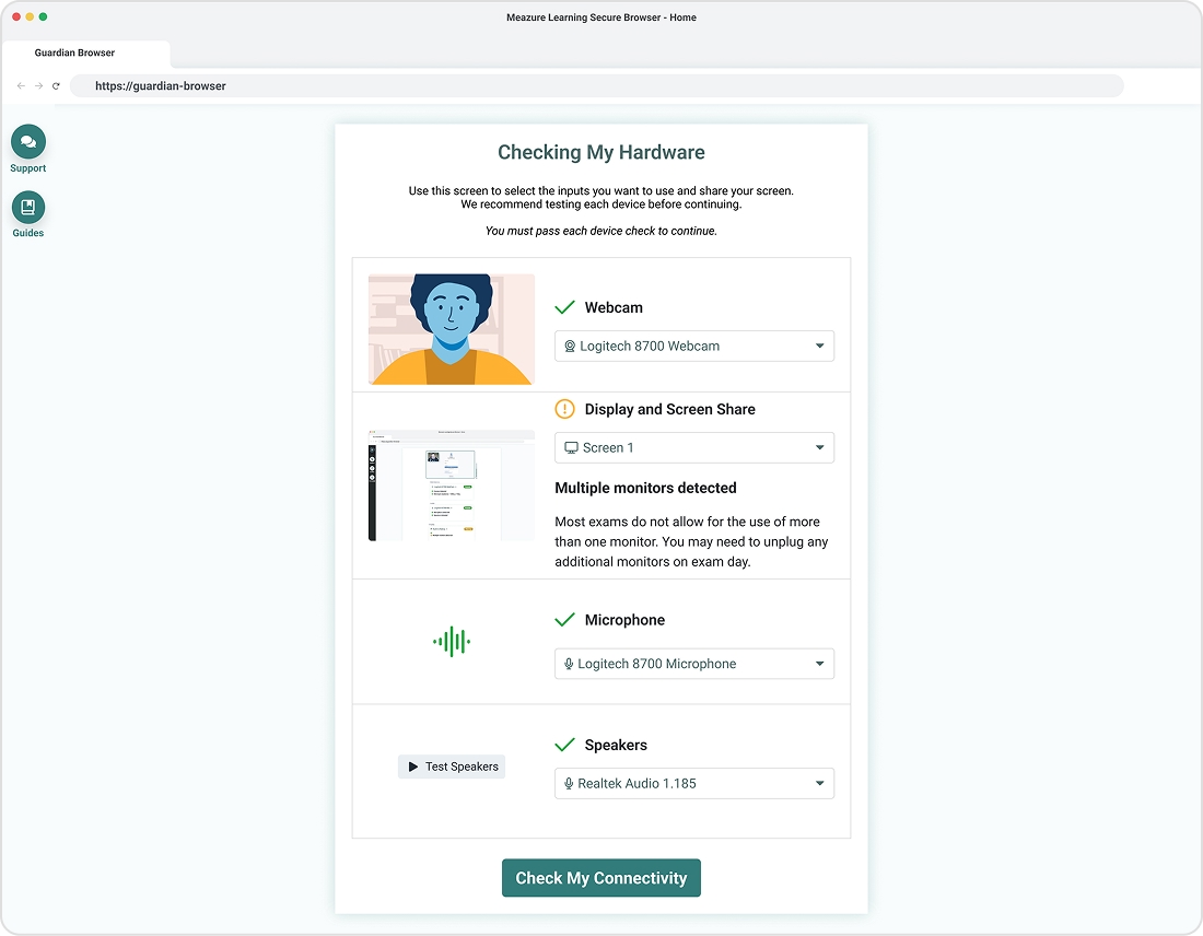
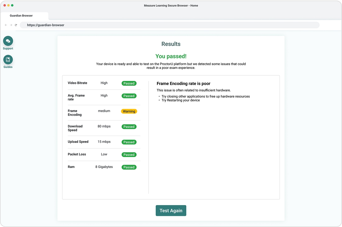
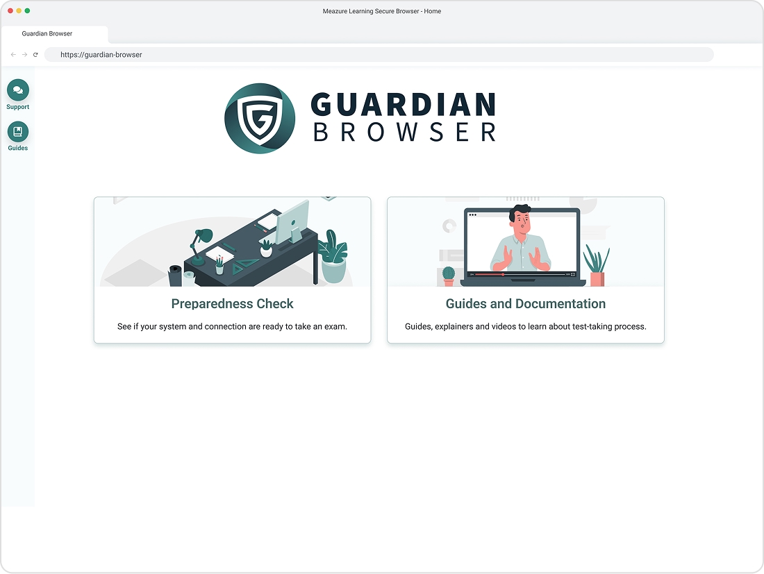
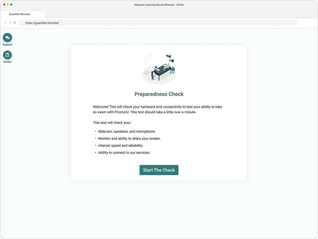
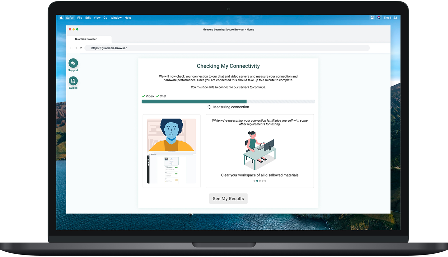
Our research led us to a design whereby the user is directed to select their hardware inputs and then undergo a one-minute benchmarking process. Using the information gathered during the selection and benchmarking, we are able to inform the user of their level of compatibility with our software and processes.
While the user is taken through this process, they’re presented with a pleasant amount of color, variety, animation, and information. Even though they’re asked to wait while a benchmark occurs, they never get bored and even learn a few helpful tips and tricks while they sit.
If the user falls below our minimum specification, they’re given ample and well-phrased solutions that they can use to fix their issues and retest. These instructions are also linked to our support systems and information libraries, ensuring that no test taker is left out.
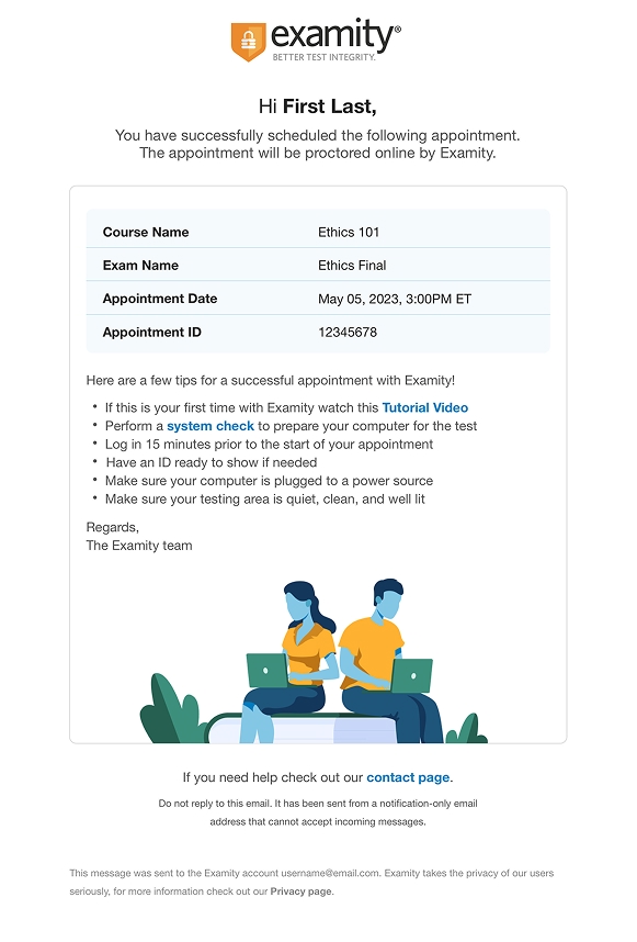
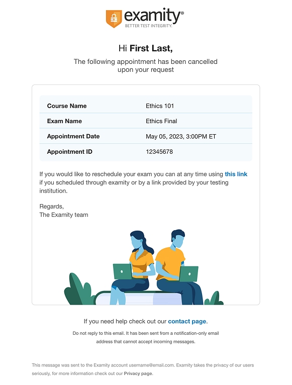
Examity Overhaul Email Redesign & Recode
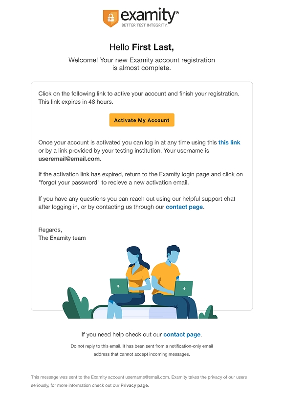
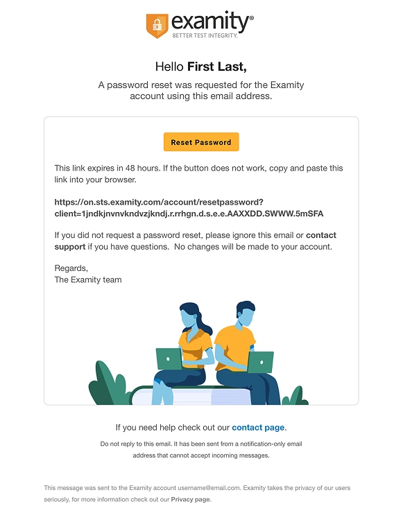
Following the successful redesign and rebranding of the core Examity product line, I was tasked with overhauling the Examity email library. I sought to bring the same user-centric and component-driven design process to this task that served us so well in the overall redesign. Emails are a tricky beast; there’s no true coding standard, and each email client renders them differently in subtle and not-so-subtle ways. For this project, hardware testing across multiple devices, browsers, and operating systems was a must.
The designs shown here were implemented with success (and some fanfare) as both dark and light mode compatible in all popular clients. The process of coding and QAing them was quite the learning experience.
Forecaster 121
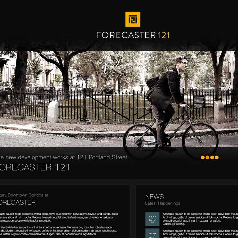
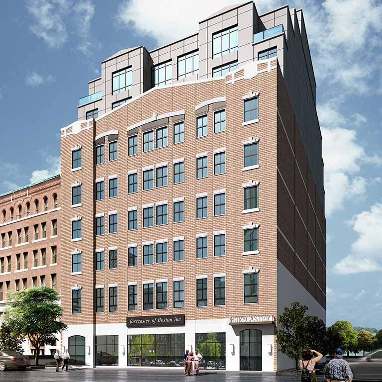
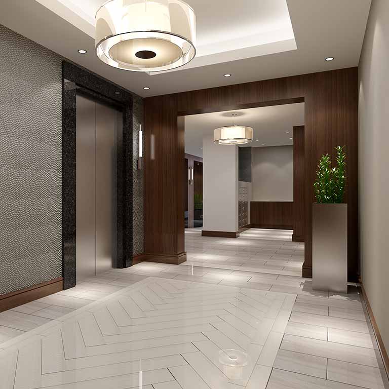
How do you differentiate the brand of a luxury condo complex in a city where a new one pops up every week? Finding an answer was the task when I was asked to handle the marketing for Forecaster 121.
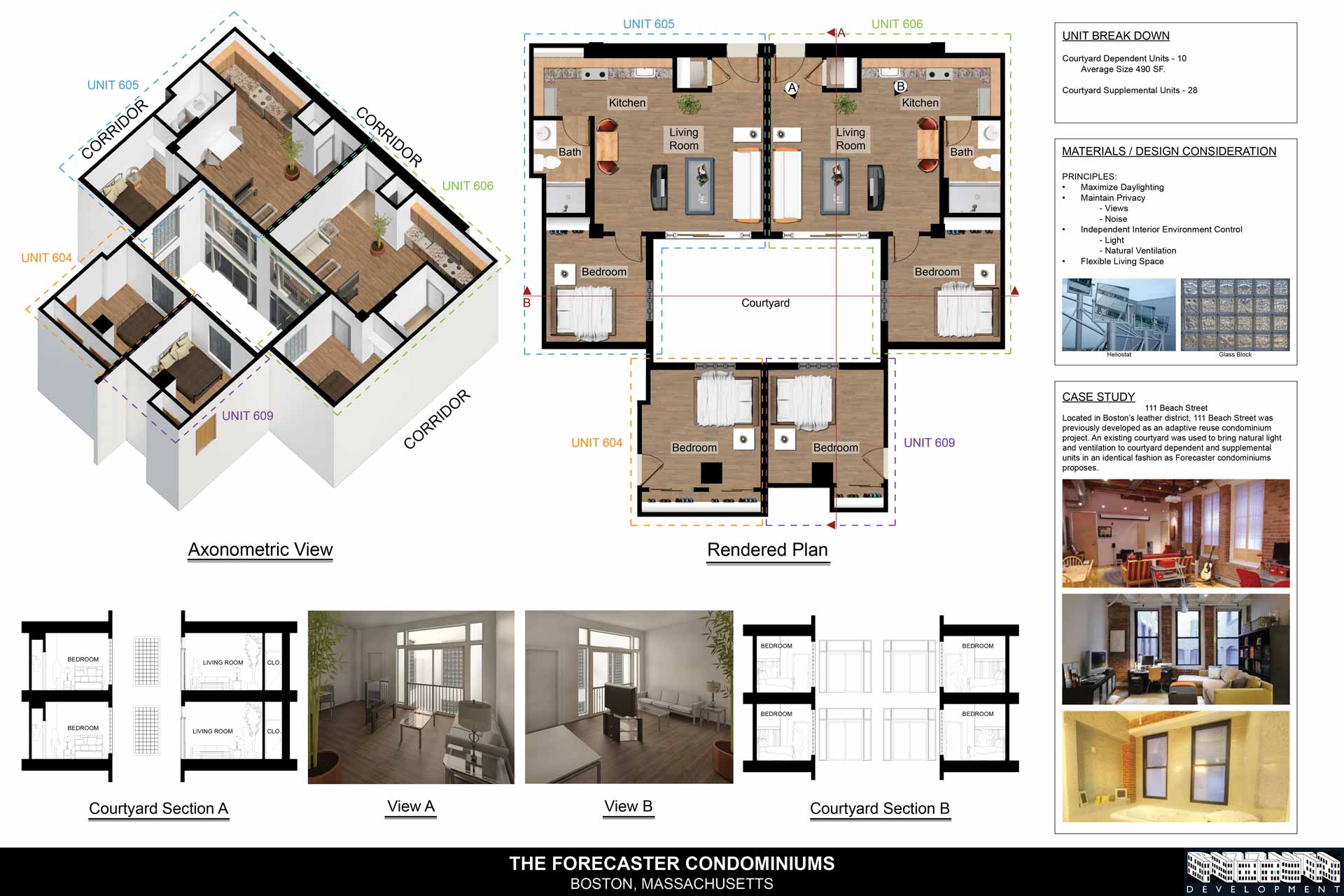
The process of developing the marketing for a building is a pretty amazing process. Not only are you marketing to a prospective public that won't see the home they've pre-purchased for months or even years, but you're marketing to the city itself. Local zoning, air rights, and feature and historicity proposals—there's a lot to consider when building in the heart of a city, and wooing the city board is almost as important as wooing prospective home buyers.
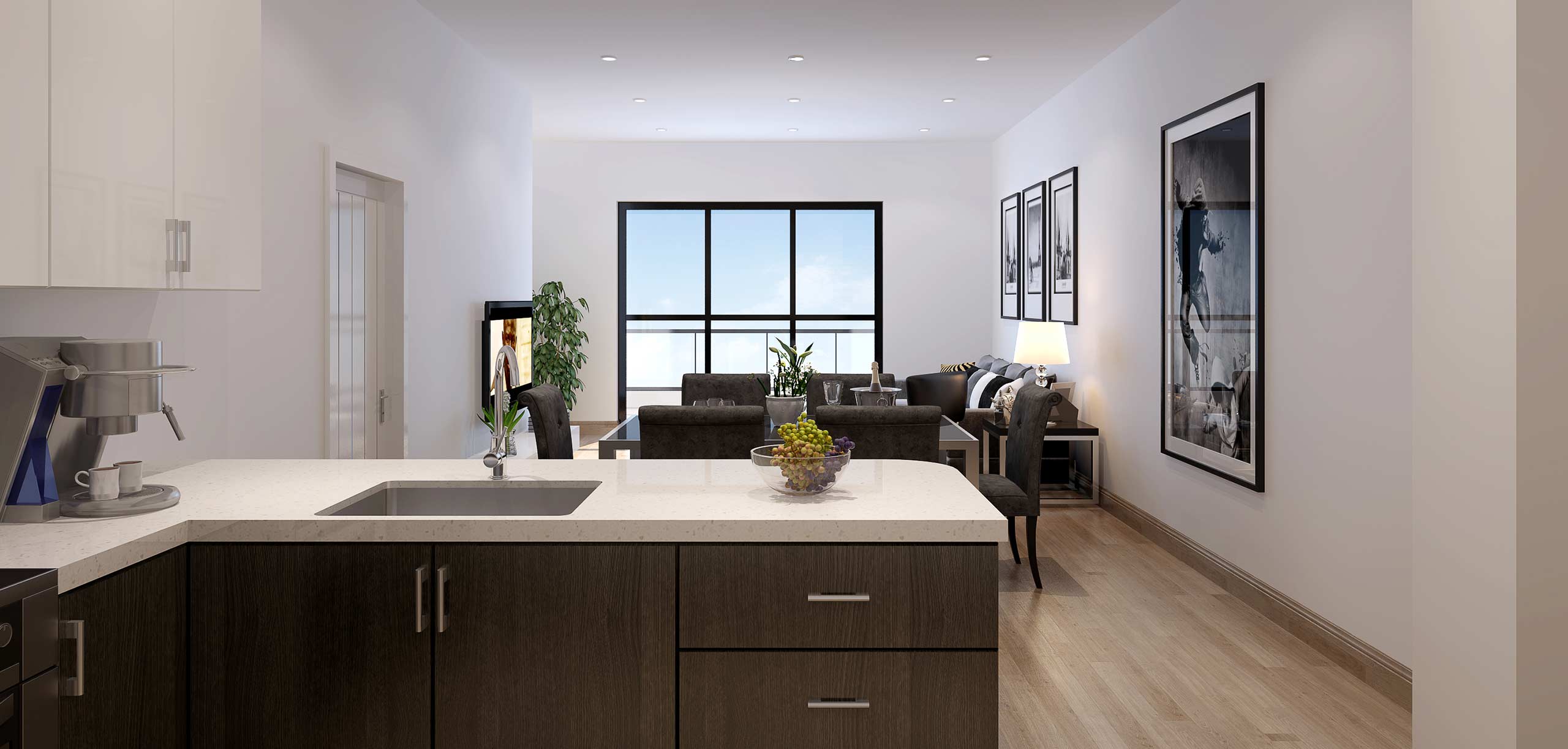
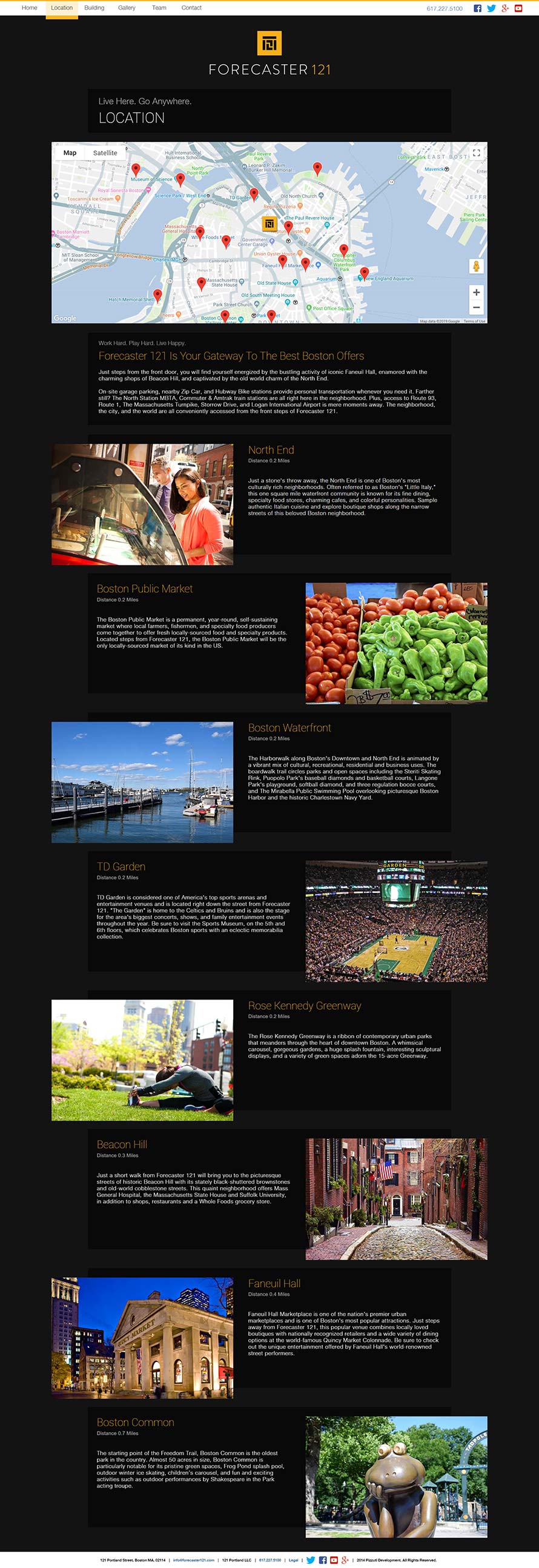
With Forecaster 121, I went with a traditional color combination that speaks to luxury: gold to speak to quality and black to accentuate the gold and provide a contemporary sharp contrast. Combining color identity with a sharply modern sans serif font and a modernist block logo helped to complete the initial identity, but there was a lot left to do.
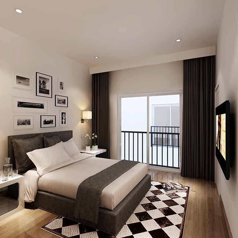
This project was really fun because I got to stretch my legs in every area of design, from photography to print to digital. I was building a responsive website and mail templates at the same time I was designing 60-foot banners meant to hang from the sides of high-rises. I also got to help make proposals to the city look all the more professional and convincing, which really helped me learn the nuances of designing within the constraints of government needs.