Meazure Learnings Responsivity and Accessibility Redesign
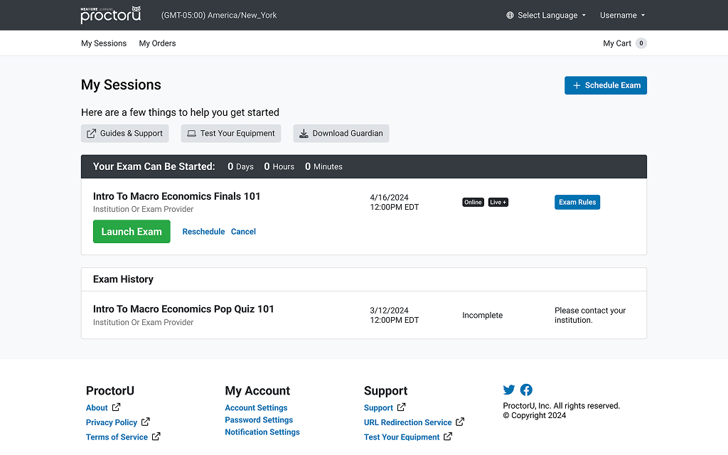
Meazure Learning is an end-to-end online proctoring and testing platform provider that helps academic students and career professionals take exams and assessments from their homes. With today's heavy emphasis on accessibility and interoperability, the front end of the platform needed to become responsive and accessible. In addition, the platform needed a significant overhaul to many of its functions and components to declutter and provide an intuitive interface for a wide variety of users.
This was no small task; the platform had existed for over a decade as a continuously iterated-upon product with legacy requirements and quite a few skeletons in its closet. To that end, we embarked on a lengthy journey to assess user pain points, scope the full need for accessibility (full WCAG 2.2 compliance), and fulfill users' needs regardless of the device they had access to. Along the way we rebased and refactored the front end of the platform, adopted a new design standard, and implemented a newly improved component library.
By the end of the research, design, development, and testing process, the platform was WCAG certified, wholly responsive, and rebranded to fit within the modern company identity (it performed better too!).
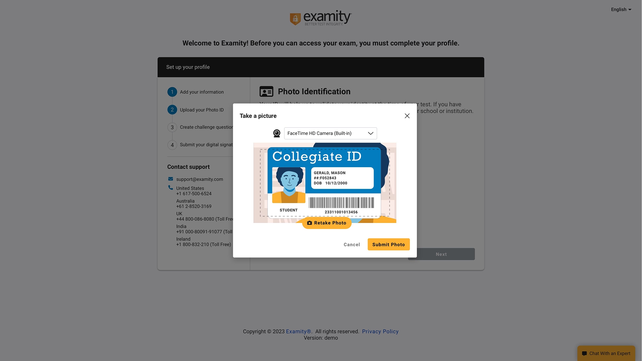
Examity’s Test Taker Flow Overhaul
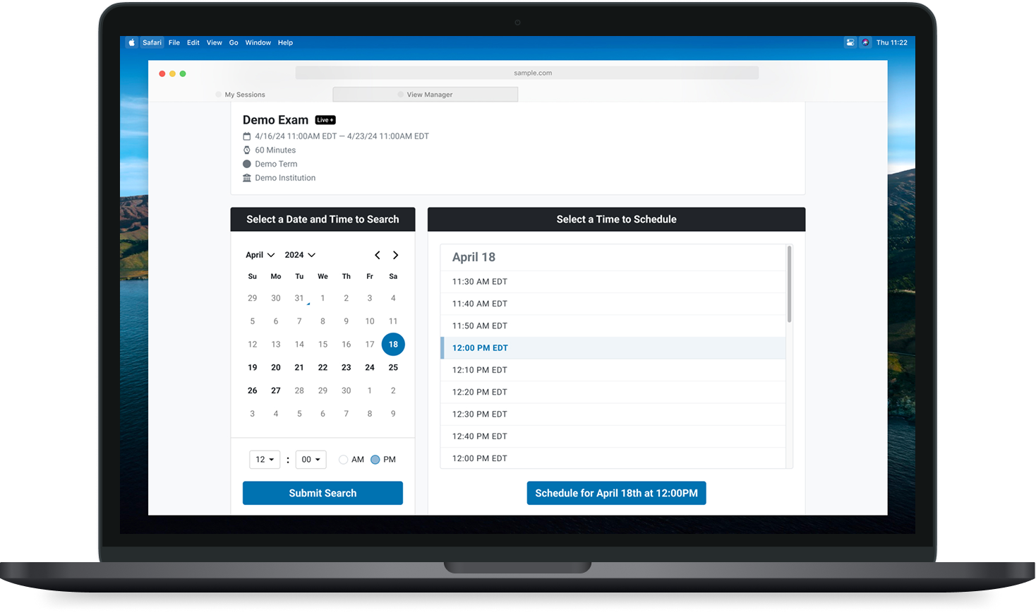
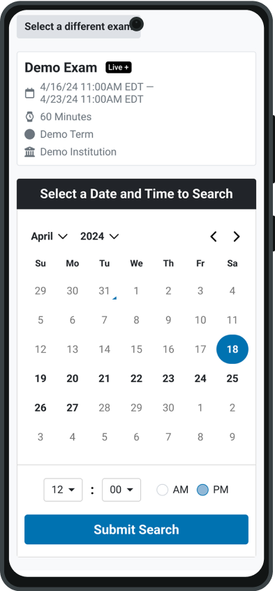
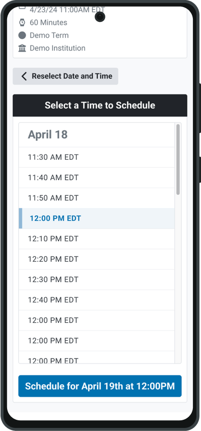
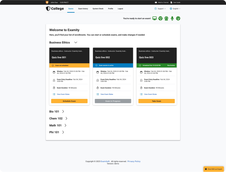
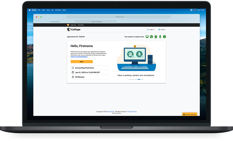
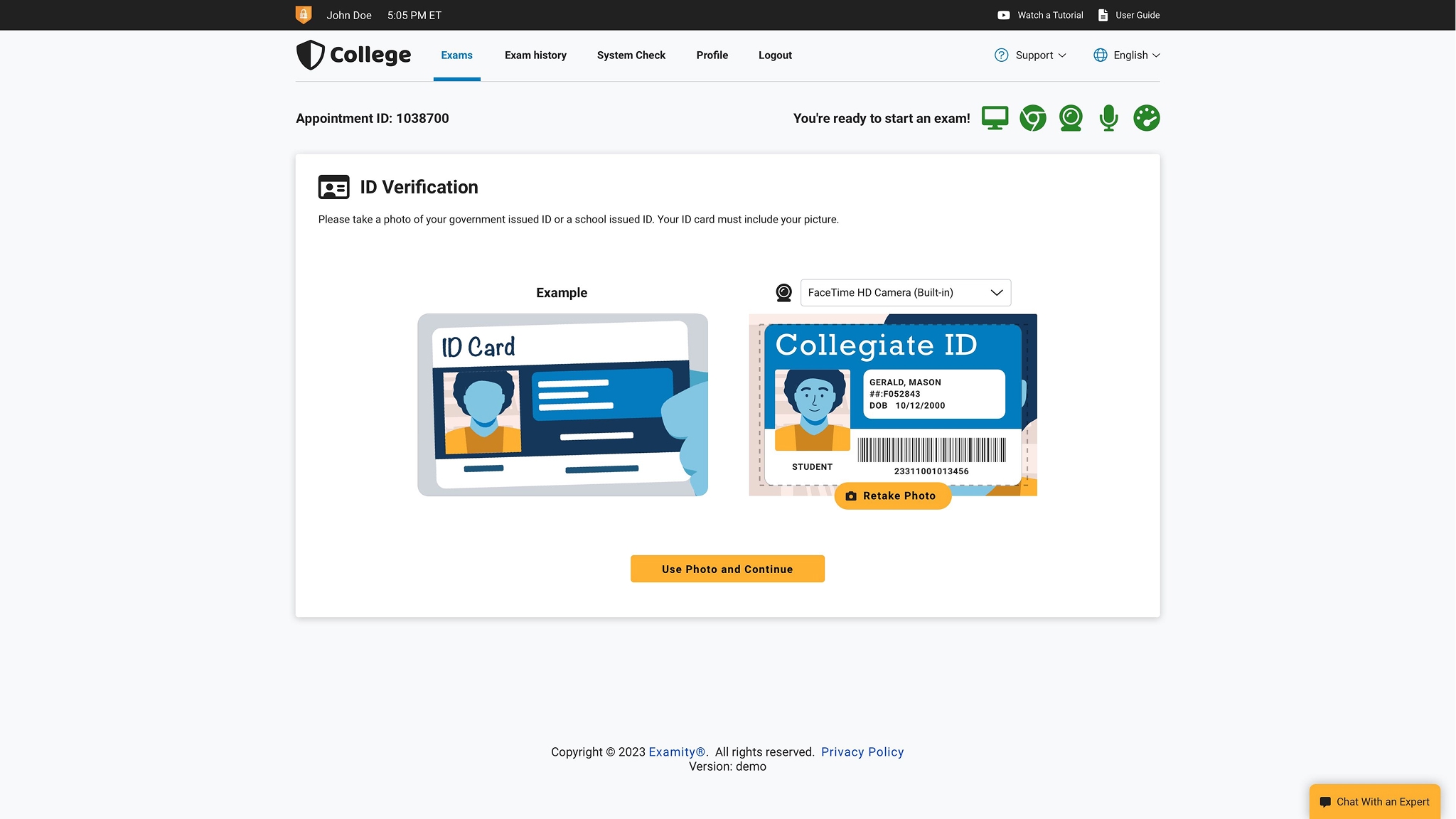
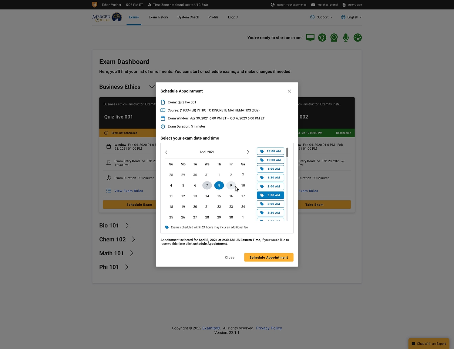
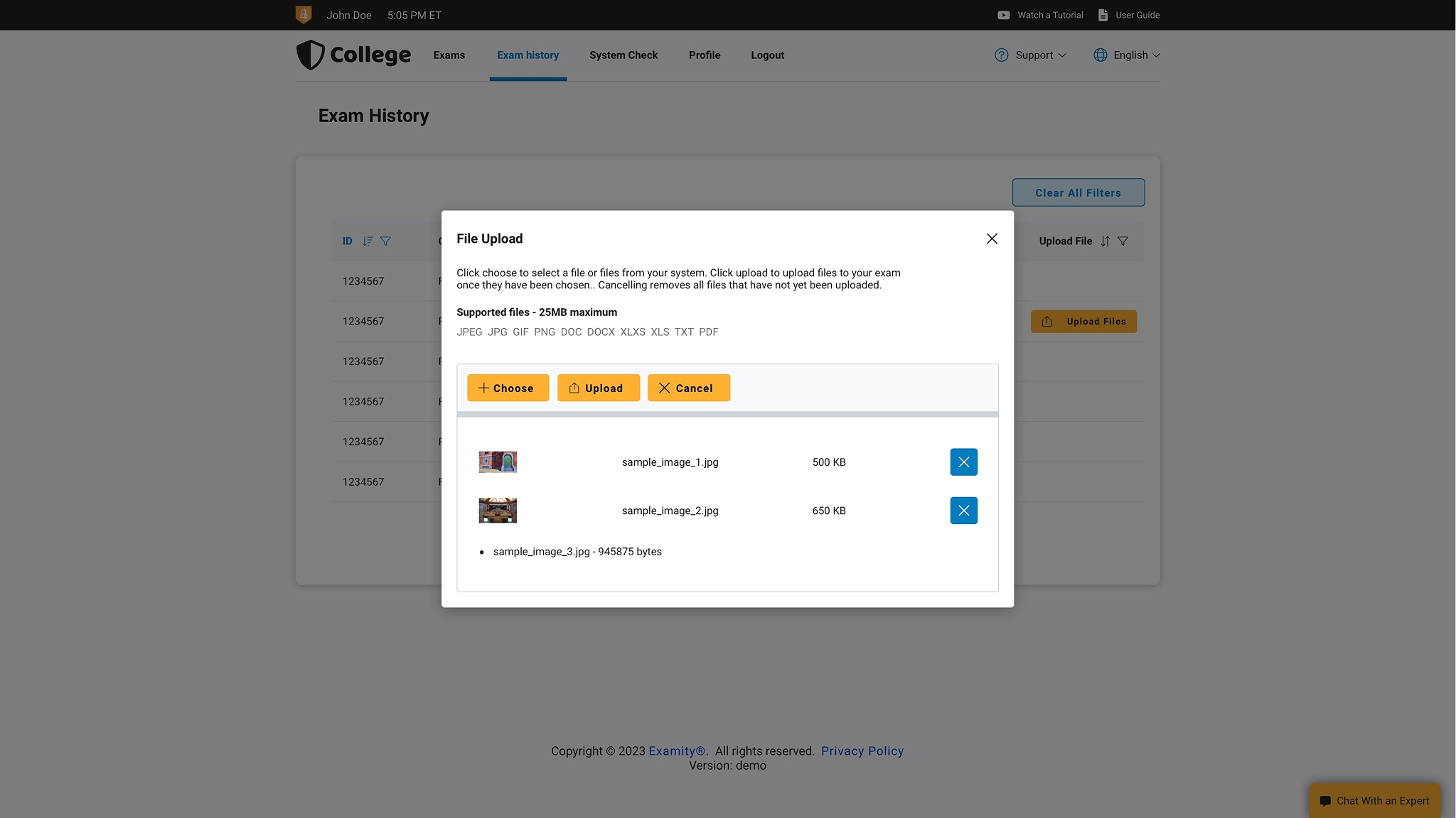
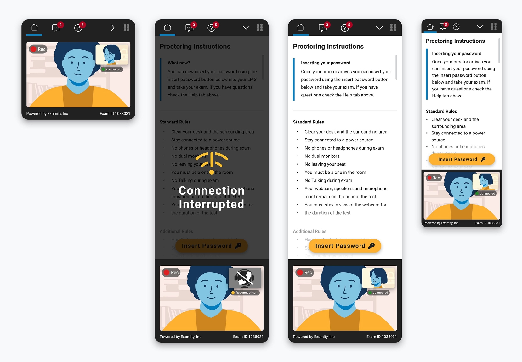
Examity provided an extension-based testing security solution that connected users to their own test providers' platform while monitoring device and real-life security issues to help maintain academic integrity. It gave users the ability to schedule, purchase, and launch exams from within its authenticated web app.
The platform had grown significantly over the preceding years and had incorporated quite a few new technologies and features but needed a significant overhaul to incorporate those features organically in a way that delighted users and provided positive results for Examity’s clients.
With those core needs in mind, a notable portion of my time spent at Examity was spent researching, designing, and guiding the iterative upgrade process that would allow the platform to shine.
One of the key elements of the overhaul was the need to introduce vibrancy, boldness, and fun to the UX of Examity. Academic and professional testing is a stressful process. No one likes taking exams! A core finding of our research was that a good testing experience is a stress-free experience, and by creating a set of interfaces that provide maximum visual clarity while also being charming helps reduce the friction users feel while they navigate through the test-taking process.
My designs reduced the mono-color and text-heavy nature of the original platform while introducing a consistent brand-driven color theory and a defined set of standards for the use of imagery, animations, and iconography. Clients and users alike responded strongly to the redesign, and we followed it up with similar visual and thematic overhauls to other Examity products.
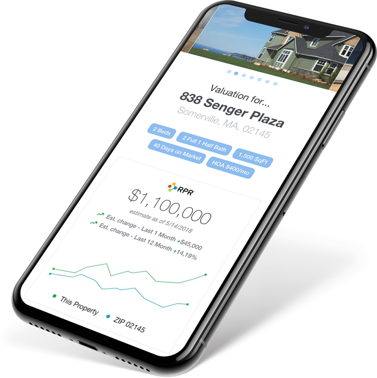
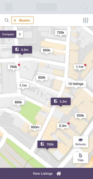
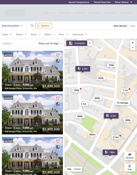
Sequoia Redesign
The Sequoia system is a large SaaS platform that allows real estate brokerages of any size to have and maintain a performant, reliable, and good-looking web presence that not only surfaces their inventory but also has deep marketing integrations and personnel management. It's a top-to-bottom, full-service system for getting a brand online to the fullest capacity..
The platform is fully content, image, font, color, theme, and component customizable, with a Google Material-like card system and a hierarchy of inheritance that makes fully customizing a business web platform from scratch with over fifty unique pages take minutes.
How do you develop a system that allows for fully custom content without overwhelming an audience traditionally outside of the technology space? And how do you do it in an age where designs have to respond to many different devices and input methods? This was a big ask, and we worked with customers and through multiple stages of design to find the best solution. Systems like Squarespace had a piece of the puzzle but are far too complex for the laymen audience.
In the end, a hybrid design of internally produced layout templates, user-chosen card components, and a development focus on extensible, structured coding practices that could keep it all together proved to be the best route forward.
Rapid Prototyping My Own Portfolio
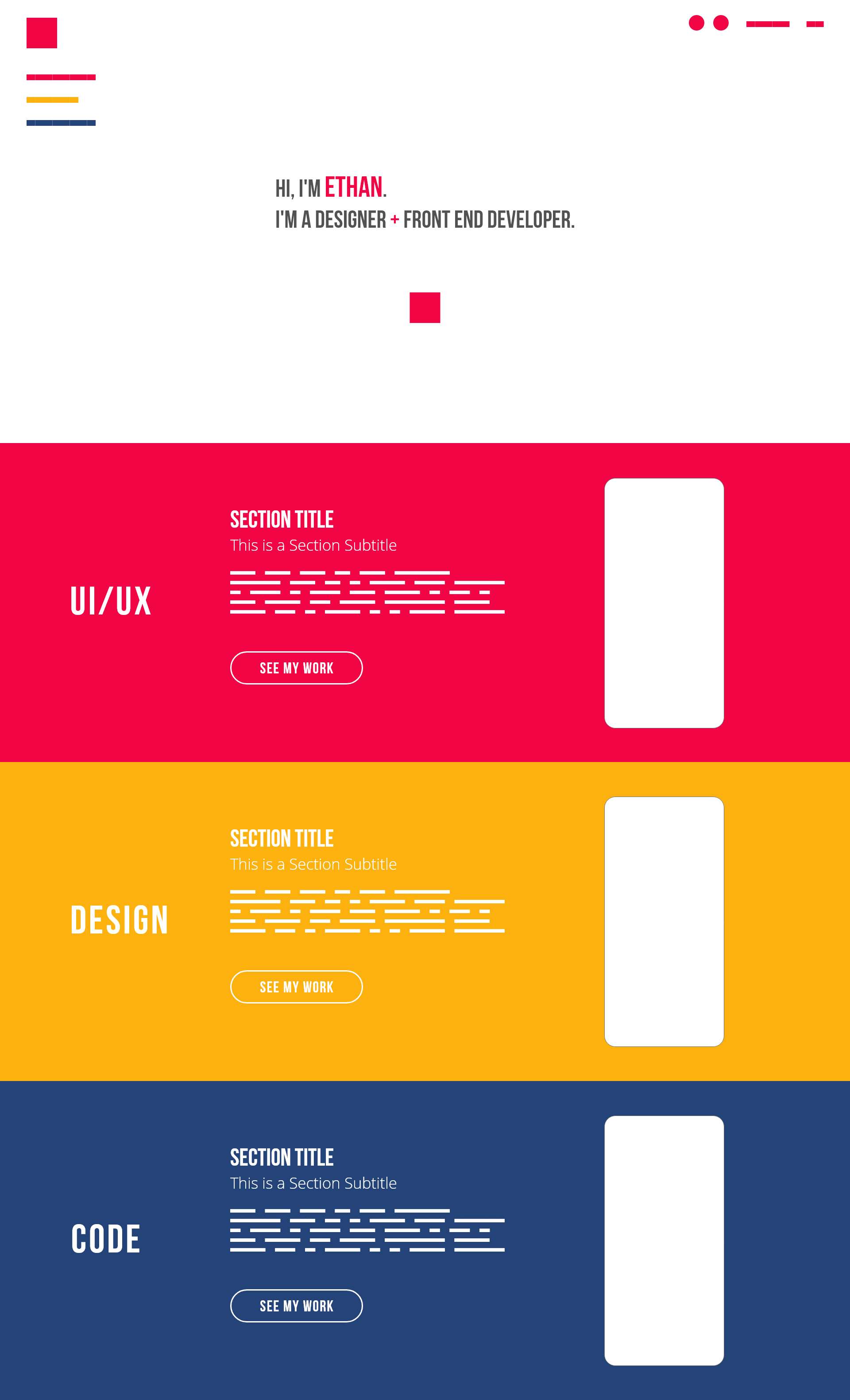
The design process is an exercise in research and understanding as well as design. A design portfolio is meant to be a piece itself, and the experience that it delivers comes across just as strongly as any of the projects or stories it tells. In rebuilding this site, I wanted to make sure it came across as human, striking, and unique. Being personal but also professional is a tough needle to thread, but I decided to try to do it in a weekend.
First was brand identity. I chose a combination of strong, basic additive colors that would be instantly familiar but still impactful to anyone. Similar, but more constrained than the palette used in my last portfolio. I followed up with numerous tests for font combinations as well as some blocking to see how the colors contrasted with imagery and type. I settled on a combination of the tried and true Open Sans and the playful Bebas Neue, which provides a comic-like blocking to my headlines that suits the primary colors.
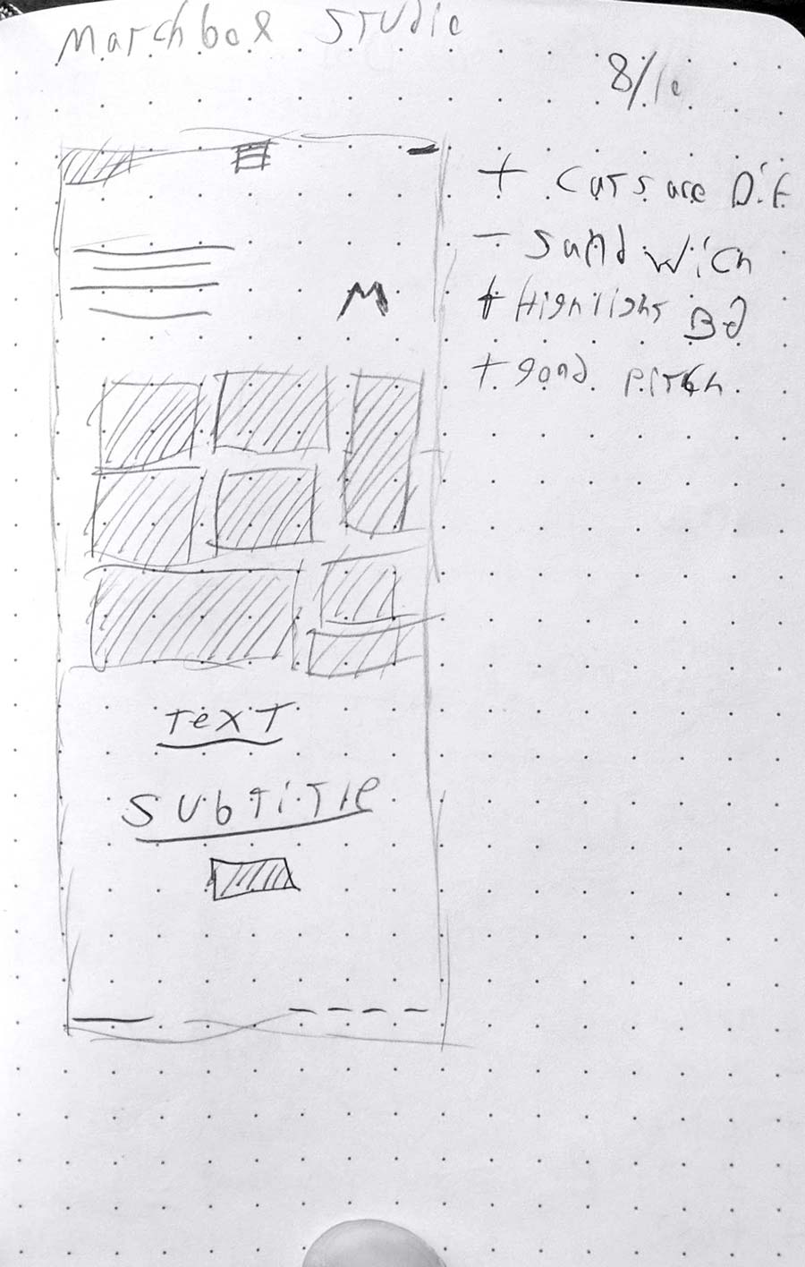
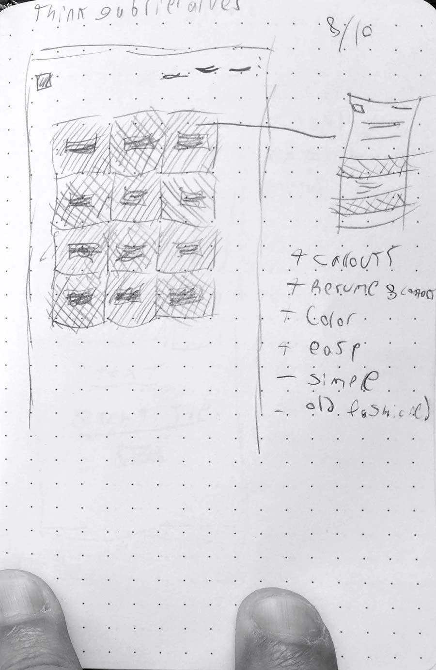
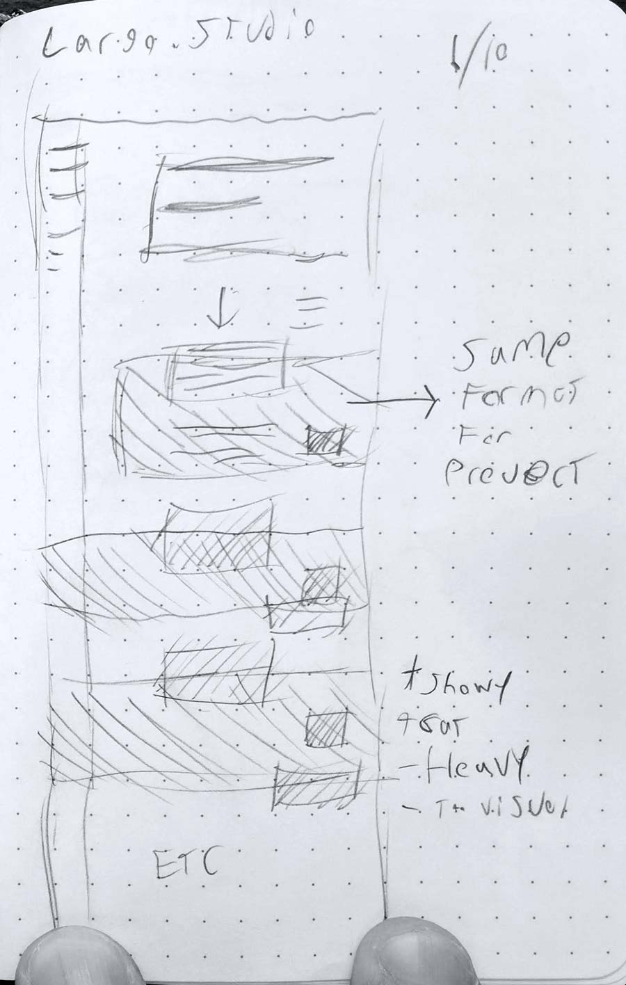
While researching color and type, I was looking at my "competition." In many ways a portfolio is a statement of fashion, with different professional careers opting to express themselves in different ways. I browsed many award-winning sites from the past few years and mocked up treatments by hand on a trusty dotted mini-sketchbook. This not only helped me determine content flow and layout but also started the process of winnowing down what content I would want to display and how. It also gave me a window into the whys of other professionals, as well as what was working and what wasn't.
There are limits to what can be blocked out by hand; animation and complex navigation styles that don't map 1:1 to a piece of paper exist, but they are fast and can really narrow down scope and provide a basis for further work. In the end I had mocked up 10 sites as well as my own, while notating what worked, what didn't, and what kinds of technologies and features I believed I could work into the process.


Rapid prototyping of designs is a big benefit of modern design software. For this project, I used Adobe XD to do the early blocking. From there I was able to create clickable prototypes that helped me determine scale and flow, as well as figure out a bit of my navigation. There are limits to this kind of prototyping, whether it's technical or structural. For instance XD is incapable of the kind of within-page links that I use on this site. But, much like the sketch mockups, it helps to further clarify the final design as well as present weaknesses and strengths. With the prototype built, I moved on to a semi-final treatment of the design itself, still using XD but featuring functional placeholder content and text.
The box below is a version of my early clickable prototype. Go ahead and try it out (It's interactive)!
